You’ve spent weeks perfecting your logo. You have chosen the perfect bag style. and you’ve budgeted for a decent order quantity. And then the bags arrive—and something feels… off. The colors look muddy. The handles seem flimsy. The bag doesn’t stand up on its own like you expected. What went wrong?
After helping hundreds of clients bring their custom bag visions to life, I’ve seen the same three mistakes surface again and again. They’re not malicious; they’re almost always born from inexperience or well-meaning but incorrect assumptions. The good news? They’re entirely avoidable. Here’s what they are and how to steer clear of them on your next project.
Mistake #1: Designing for the Screen, Not the Surface
You have a gorgeous digital mockup on your computer. It’s crisp, vibrant, and full of subtle gradients. You send it to your supplier, confident it will look exactly the same on the bag. And then the sample arrives, and the fine details are lost, the gradients look posterized, and the overall effect is disappointing.
This happens when you forget that fabrics are not screens. A 100 GSM non-woven polypropylene bag has a textured, slightly porous surface. A 12 oz cotton canvas is absorbent and irregular. Digital printing and screen printing have resolution limits, and tiny fonts or intricate line art simply won’t translate.
How to avoid it:
- For screen printing, use vector artwork (AI, EPS) and limit your design to 2-4 solid colors. Avoid fine lines thinner than 2pt.
- For digital printing, use high-resolution raster files (300 dpi, CMYK) and test on a material swatch first.
- Always order a pre-production sample and judge it physically, not on screen.
- Rule of thumb: simplify your artwork for fabric. Bold, clean designs always outperform complex digital art on promotional bags.


Mistake #2: Overlooking the “Carry Experience”
You chose a bag that looks fantastic on the shelf. It’s stylish, the print is perfect, and the color matches your brand. But when a customer actually uses it—the handles dig into their shoulders, the bag sags awkwardly, and the zipper catches every time—they’ll form a negative association with your brand, even if they don’t consciously realize why.
The “carry experience” is the sum of small details: handle length and comfort, bag balance when loaded, ease of opening and closing, and how the bag feels against the body. Many designers focus purely on aesthetics and miss these functional nuances.
How to avoid it:
- Think about the actual use case. Who is carrying this, and for how long?
- Test handle drop lengths. A 25 cm handle is good for hand carry; 50 cm is better for shoulder carry.
- For totes, ensure the handle attachment points are reinforced with bar-tacking or heat sealing.
- Load the pre-production sample with typical contents (weight and shape) and carry it around for 10 minutes. Does it feel comfortable? Does it hang well?
- If your bag has a zipper, open and close it 20 times. Does it snag?

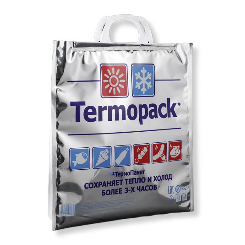
Mistake #3: Sacrificing Quality for the Lowest Price
This is the most common and most painful mistake. The budget is tight, so you choose the cheapest option. The GSM is lower than recommended. The handles are basic. The printing is a single color, even though your design really needs two. You save a few cents per bag—and end up with a product that feels cheap, falls apart quickly, and reflects poorly on your brand.
As an industry expert, I’ll tell you straight: the cheapest bag is almost never the best value. A flimsy bag that tears after three uses has a terrible cost-per-use ratio. A slightly more expensive bag that lasts for months delivers far more brand impressions per dollar.
How to avoid it:
- Shift your mindset from “lowest unit cost” to “best lifetime value.”
- Specify a minimum GSM: 80 for basic non-woven, 100+ for a quality feel. For fabric, choose at least 140 GSM for durability.
- Invest in reinforced handles—a few extra cents per bag can prevent handle failure, which is the #1 complaint about cheap bags.
- Don’t skimp on printing. A muddy, faded logo is worse than no logo at all. Use Pantone color matching for consistent, professional results.
- Get quotes from multiple suppliers, but compare like-for-like specifications, not just bottom-line prices.
The Bottom Line
Custom bag design is a balancing act between aesthetics, function, and cost. The best results come when you treat your bag not as a simple giveaway, but as a functional product that carries your brand’s reputation. Avoiding these three common mistakes—designing for the wrong medium, ignoring the carry experience, and chasing the lowest price—will save you money, frustration, and brand damage in the long run.
At EcoPromoBags, we help clients navigate these design decisions every day. We can review your artwork, recommend the right materials, and provide samples that let you test before you commit.
Ready to design a bag that looks great and works even better? Contact us today for a consultation and a no‑obligation quote.