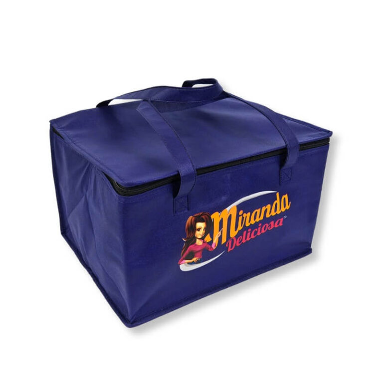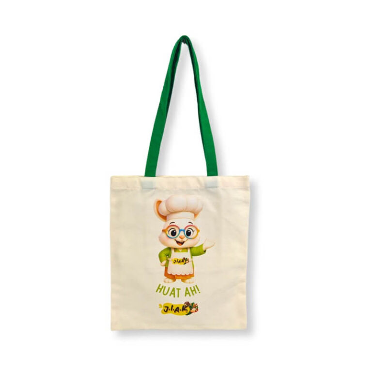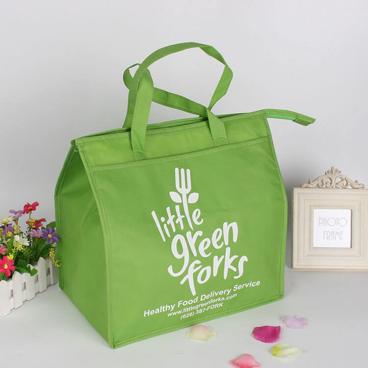
You’ve spent weeks finalizing your logo. The brand color is exactly right—a deep, confident navy blue. You approve the digital mockup, place the order, and wait. Then the bags arrive. The navy is… off. It looks slightly purple, or maybe a little washed out. It’s not what you signed off on. And now you’re stuck with thousands of bags that don’t match your brand.
This scenario plays out more often than most buyers realize. Color matching in custom bag printing is not as simple as picking a hex code and hoping for the best. It’s a science—and a craft—that involves materials, inks, lighting, and precise measurement. Understanding the fundamentals will help you avoid costly surprises and get the results you actually want.
Why Color Matching Is Harder on Bags Than on Paper
When you print a business card or a brochure, you’re working with a coated paper surface that absorbs ink in a predictable way. Bags are different. They’re made of fabric, non-woven polypropylene, canvas, jute, or paper. Each material has its own texture, porosity, and base color. And that base color affects how the final printed color appears.
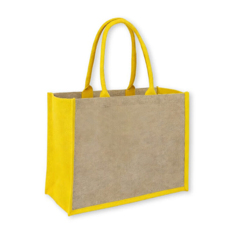
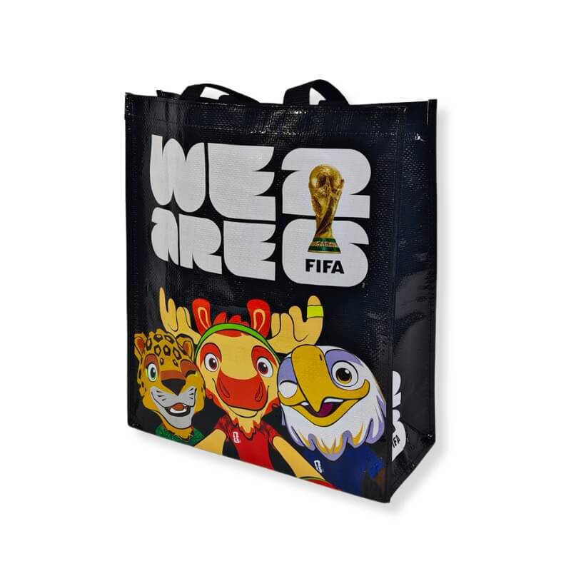
Take non-woven polypropylene. The fabric itself is usually white or off-white, but it has a slightly fibrous surface. Ink sits on top rather than soaking in completely. That can make colors look more vibrant, but it can also cause them to appear lighter or less saturated than on paper. Canvas and cotton are more absorbent. They drink in the ink, which can dull bright colors and shift shades. Jute is naturally brown, so printing on it requires either a white underbase or accepting that the final color will be muted by the background.
This is why specifying a Pantone color on a bag doesn’t guarantee an exact match. The substrate is part of the equation.

The Role of Pantone and Color Measurement
Most professional bag printers use the Pantone Matching System (PMS). Each Pantone color has a specific code—like Pantone 2945 C for a strong blue. The “C” stands for coated, meaning the ink is formulated for a coated surface. On fabric, you might use the same code, but the result will differ because the fabric isn’t coated.
To get closer to an accurate match, printers use a spectrophotometer. This device measures the actual color of the printed fabric and compares it to the Pantone reference. It gives a numerical “Delta E” value—a measure of how far off the color is. A Delta E of 1 or less is generally considered an excellent match. A Delta E of 3 or more is noticeable to the human eye.
But here’s the catch: not every factory has a spectrophotometer. Many rely on the human eye, which is subjective and affected by lighting. If your supplier doesn’t measure color objectively, you’re relying on luck. Ask them how they verify color accuracy. A good factory will have a documented process.
How Printing Method Affects Color
The printing method you choose also changes how color appears.
Screen printing uses thick, opaque inks that sit on top of the fabric. It produces bold, vibrant colors and is excellent for solid Pantone matches. But each color requires a separate screen, so complex designs with many colors become expensive. Also, the ink layer can feel raised and may crack over time if not properly cured.
Digital printing uses tiny droplets of ink, similar to an inkjet printer. It handles gradients and photographs beautifully, but the colors may appear slightly softer or less saturated than screen printing, especially on textured fabrics. Digital printing is also limited by the fabric’s ability to accept the ink—some synthetic fabrics require a pre-treatment to hold the color well.
Heat transfer involves printing the design onto a transfer paper and then applying it with heat and pressure. The color accuracy can be very high, but the hand-feel is smoother than screen printing. However, heat transfer works best on polyester and can be less durable on natural fibers.
Practical Steps to Get the Color You Want
So how do you navigate this? Here’s what I recommend to every client.
1. Start with a physical sample. Never approve a color based on a digital screen. Screens emit light; fabrics reflect it. They will never match exactly. Request a pre-production sample with your actual logo and color on the actual fabric you plan to use. Judge it under natural daylight, not office lighting.
2. Provide a Pantone reference, not just a hex code. Hex codes are for screens. Pantone is for print. If you don’t have a Pantone code, ask your printer to recommend the closest match. They should be able to show you a physical Pantone book.
3. Understand the material’s limitations. If you’re printing on jute, expect a rustic, muted look. If you need bright, exact colors, choose a white or light-colored fabric with a smooth surface. Don’t fight the material—work with it.
4. Ask about color tolerances. Even with the best process, some variation is normal. Ask your supplier what Delta E tolerance they work to. A reputable factory will aim for a Delta E of 2 or less for critical brand colors.
5. Check lighting conditions. Colors look different under fluorescent lights, incandescent bulbs, and sunlight. Evaluate your sample under the same lighting conditions your customers will experience. If possible, check it in daylight.

Common Color Problems and How to Avoid Them
Problem: The color looks different from the digital mockup.
Solution: Expect this. Digital mockups are a starting point, not a guarantee. Always approve a physical sample.
Problem: Colors vary between different bags in the same order.
Solution: This can happen if the factory uses different fabric lots or doesn’t control ink consistency. Ask about their batch control procedures.
Problem: The print fades after a few washes.
Solution: This is usually a curing issue. Ensure your printer uses proper ink and curing temperatures. For bags that will be washed, specify a wash-resistant ink.
Problem: The color looks dull on canvas but vibrant on non-woven.
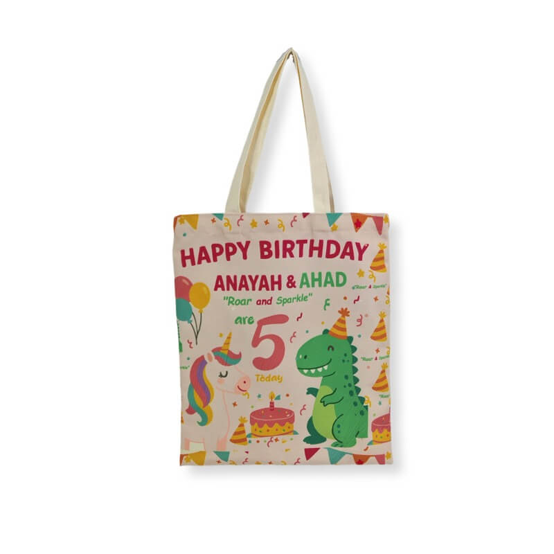
Solution: This is a material difference. Adjust your expectations or choose a fabric that better suits your color goals.
The Bottom Line
Color matching in custom bag printing is not a one-step process. It’s a chain of decisions—material, ink, printing method, and quality control—that all affect the final result. The best way to get what you want is to communicate clearly, request physical samples, and work with a manufacturer who understands the science, not just the sales pitch.
At EcoPromoBags, we help clients navigate these color challenges every day. We use Pantone references, spectrophotometer verification, and physical samples to ensure your brand colors look right on the bag. Whether you’re printing on non-woven, canvas, or paper, we can guide you to the best approach.
Ready to get your colors right the first time? Contact us today for a consultation and a sample. Let’s make your brand shine—accurately.